The Ultimate Room-by-Room Guide
Here’s something most paint companies won’t tell you upfront: the color on your wall does far more than decorate a room — it rewires how you feel inside it. That’s not a design cliché. It’s backed by decades of color psychology research, and in 2026, the world’s leading paint brands are leaning into this science harder than ever before. Whether you’re redoing a single bedroom or repainting your entire home, the choices you make this year are unlike anything we’ve seen in the past decade.
We’re living through a full swing of the pendulum. The cold, clinical grays and icy whites that dominated interiors through the 2010s? They’re officially on their way out. In their place, something warmer, richer, and far more soulful is arriving — and it’s here to stay. This guide, brought to you by Gregory Martin Painting, will walk you through every dimension of the modern home paint colors 2026 landscape: what the top brands chose, what actual interior designers are using, how warm and cool tones compare, what luxury looks like on a wall, and — critically — how to get it right the first time.
Let’s get into it.
What Are the Best Modern Home Paint Colors for 2026?
Before we go room by room, let’s answer the primary question directly: the best modern home paint colors for 2026 are warm, earthy, and nature-driven. We’re talking smoky jades, warm greiges, dusty botanical greens, deep muted charcoals, earthy terracottas, and rich burgundy reds. These aren’t just “pretty colors” — they represent a cultural shift toward comfort, authenticity, and emotional depth in interior design.
The key themes driving the latest wall color trends 2026 are biophilic design — colors inspired by forests, clay, stone, and botanical life — warmth over sterility, the death of millennial gray, and the rise of inviting neutrals. Tonal complexity is equally important, with shades that shift and evolve depending on lighting. The most sophisticated palettes of 2026 also embrace layered depth, pairing bold tones with soft pastels instead of sticking to one flat color family.
According to color trend authorities like WGSN and the major paint brands, comfort and grounding are the clearest signals of 2026’s design direction. After years of clean, minimal, and cold aesthetics, homeowners are craving spaces that actually feel like home.
2026 Color of the Year Picks From the Industry’s Biggest Brands
The industry’s annual Color of the Year announcements are like the Oscars of interior design — they tell you exactly where sophisticated taste is heading. Here’s what 2026’s major players chose, and what it means for your walls.
Benjamin Moore — Silhouette AF-655
Benjamin Moore’s 2026 color of the year is Silhouette AF-655 — a deep, muted charcoal-plum. It’s a fascinating blend of gray, brown, and violet that reads differently depending on the lighting in your room. In bright daylight, it presents as a sophisticated dark gray. In the evening under warm light, it pulls richer and more plum. It anchors their 2026 trend palette of enchanting pales, handsome midtones, and grounded deep shades — a palette that encourages layering bold tones with delicate pastels, producing interiors that feel calm, elegant, and richly dimensional.
Silhouette works beautifully as a commanding focal wall in living rooms or dining rooms, on built-in cabinetry in kitchens against lighter countertops, in dramatic entryways paired with crisp white trim, and as a moody ceiling color in intimate dining spaces.
Behr — Hidden Gem
Behr went with Hidden Gem — a smoky jade that has become one of the most discussed trending interior paint colors of the year. What makes Hidden Gem special is its chameleon-like quality: it shifts with changing light, presenting as a calming blue-green hybrid that works as a subtle accent or a full drench treatment covering walls, ceiling, and trim. It is sophisticated without being pretentious.
HGTV Home by Sherwin-Williams — Honest Essentials
Sherwin-Williams took a grounded, earthy approach with their collection called Honest Essentials, anchored by Universal Khaki — a sandy, warm shade that pairs beautifully with modern architecture’s clean lines. Their color experts recommend layering complementary shades: think Cordovan to ground a room, with lighter Reddened Earth absorbing light for a peaceful sunrise-and-sunset effect.
Valspar — Warm Eucalyptus
Valspar’s Warm Eucalyptus captures the lighter, airier end of the botanical green trend. It is a sage-adjacent tone that feels restorative, breathing life into kitchens, bedrooms, and open-plan living areas without overwhelming the senses.
Glidden — Warm Mahogany
Glidden’s pick, Warm Mahogany, is a terracotta-leaning red with an uplifting, sun-warmed quality. It is one of the rare hues that appears across all major design themes this year — a signal that earthy red tones are having a serious cultural moment. Use it as a full color drench for warmth, or limit it to woodwork for a subtler effect.
Dulux — Rhythm of Blues
Dulux took a different approach, selecting not one but three colors — a versatile family of indigos: Free Groove, Mellow Flow, and Slow Swing — ranging from deep indigo to softer blue-gray. These are ideal for homeowners who want to add personality through color without going all the way to bold statement territory.
Trending Interior Paint Colors for Every Room in 2026
Now that you know what the brands are championing, let’s get practical. Here is a room-by-room breakdown of the modern interior color schemes that are reshaping homes in 2026.
Living Room — Warm, Nuanced, and Inviting
The living room is where interior design decisions carry the highest emotional stakes. It is the room you come home to, the room you entertain in, and for many people, the room where you decompress after a demanding day. In 2026, living rooms are moving toward warm, nuanced shades that feel both timeless and inviting.
| Color Type | Example Shades | Best For |
| Warm Greige | Edgecomb Gray (BM), Accessible Beige (SW) | Open-plan living areas, whole-home palette |
| Soft Sage Green | Rosemary (SW), Clary Sage (BM) | Accent walls, nature-lover aesthetics |
| Dusty Blue | Atmospheric (BM), Quiet Moments (BM) | Pattern-forward spaces, layered looks |
| Teal | Hidden Gem (Behr), Dix Blue (F&B) | Statement walls, bold design moments |
| Plaster Pink | Dead Salmon (F&B), Setting Plaster (F&B) | Cozy, sophisticated warm neutrals |
| Deep Charcoal | Silhouette (BM), Iron Mountain (BM) | Focal walls, moody accent applications |
Pro Tip from Gregory Martin Painting: Always test your living room swatch on at least two feet of actual wall — not a paint chip — and evaluate it in the morning, afternoon, and evening. Living room colors shift dramatically across a single day as natural light changes. A sage green that looks perfect at noon can appear almost gray by 6 PM.
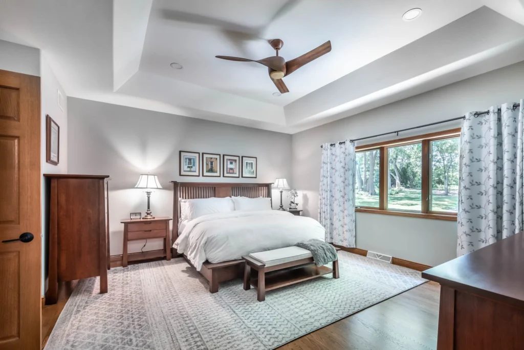
Bedroom — The Science of Sleep-Friendly Colors
Your bedroom color is more important than most people realize. Research in environmental psychology consistently shows that the colors surrounding us during sleep and rest directly affect our sleep quality, stress levels, and morning mood. The trending interior paint colors for bedrooms in 2026 lean heavily on the calming end of the spectrum.
Soft Blue-Greens — Highest Sleep Quality Association
Shades like Pale Powder by Farrow & Ball and Quiet Moments by Benjamin Moore are the darlings of the 2026 bedroom trend. Selecting a color that mimics natural light — particularly soft aquas — can genuinely enhance the calm of a room, especially one with limited windows.
Warm Greige and Mushroom Tones
These are the bedroom neutrals of 2026. Mushroom taupe, soft stone, and warm-toned beige create an enveloping, cozy feeling that cool grays never could. These shades feel comforting rather than cold or stark, and they age exceptionally well alongside changing furniture and textiles.
Deep Muted Plum-Charcoal
Silhouette by Benjamin Moore works beautifully in bedrooms where you want drama and a true sense of retreat. Paired with linen bedding and warm wood tones, it creates a sleep environment that feels genuinely luxurious.
Soft Blush and Plaster Pink
Far from childish, the soft pinks of 2026 are sophisticated, dusty, and deeply warm. They pair beautifully with brass hardware and natural textures — a combination that has become one of the most popular luxury interior color ideas of the year.
Kitchen — Earthy, Bold, and Functional
Kitchens in 2026 are getting bolder. The all-white kitchen era is softening, and homeowners are reaching for cabinetry colors and wall shades that bring personality without sacrificing practicality.
The most universally loved kitchen combination of 2026 is sage green cabinetry paired with warm white walls. Warm Mahogany or deep burgundy on a kitchen island creates a rich, anchoring contrast, while warm cream or Universal Khaki walls work beautifully in open-plan kitchens that connect to living areas. Deep navy or charcoal on lower cabinetry paired with natural stone or marble countertops delivers a high-contrast, high-end look, and terracotta accents through tiling or a painted pantry door add warmth without overcommitting.
Finish Tip: In kitchens, always use at minimum a satin finish on walls and semi-gloss on cabinetry. Matte finishes, however beautiful, cannot withstand the moisture, grease, and daily cleaning that kitchens demand. At Gregory Martin Painting, we always advise clients to separate their aesthetic preferences from their finish choices in high-traffic rooms.
Home Office — Productivity Through Color
With remote and hybrid work now a permanent fixture of modern life, the home office has become one of the most important rooms in the house. The modern interior color schemes working best for home offices in 2026 balance focus-enhancing cool tones with grounding warm accents.
Cool, muted blues and blue-grays promote focus and productivity, making them ideal for work environments. Dulux’s indigo family — Free Groove, Mellow Flow, and Slow Swing — offers three distinct office-ready options depending on how much color drama you want. Forest green is another strong contender: deep, saturated greens create both sophistication and a sense of calm that keeps the mind engaged without causing fatigue.
Secret Tip: If your home office faces north and receives cool, indirect light all day, avoid pure cool blues and grays entirely. They will read as flat and draining. Instead, choose a slightly warm version of your preferred color — a greige instead of gray, a sage instead of a pure blue-green. This single adjustment can transform a room that feels uninspiring into one that genuinely energizes you throughout the workday.
Bathroom — Drama and Serenity in Small Spaces
Bathrooms offer the best opportunity to experiment with bold colors because the commitment is smaller — both in square footage and in paint cost. In 2026, the most exciting luxury interior color ideas are happening in bathrooms.
A full color drench in Hidden Gem jade or Silhouette charcoal creates a cocoon effect when walls, ceiling, and trim are painted the same shade. Deep navy on walls with white tile delivers a nautical-chic, timeless aesthetic, while warm terracotta creates a spa-like atmosphere with earthy, sun-warm energy. Soft blush or plaster pink adds warmth and sophistication without going saccharine. Cooler colors naturally make small bathrooms feel more expansive and breezy — a light blue or pale aqua is genuinely one of the most transformative things you can do with a single can of paint.
Dining Room — Where Bold Is Always Right
The dining room is the one space in your home where going bolder is almost always the right call. It is an event space — you are not in it all day. A deep, moody charcoal or a rich botanical green creates an atmosphere that makes every meal feel like an occasion.
Deep forest green, Silhouette charcoal-plum, warm mahogany red, and inky navy blue are the four dominant dining room colors of 2026. Pair any of these with crisp white trim, statement lighting in brass or matte black, and natural wood furniture for a combination that designers describe as intentionally expensive.
Warm vs. Cool Paint Tones — The Definitive 2026 Breakdown
This is one of the most frequent questions Gregory Martin Painting receives from clients: should I go warm or cool? Let’s break it down clearly and completely.
Understanding Warm Paint Tones
Warm colors sit on the red, orange, and yellow side of the color wheel. In the context of modern interior design, this includes terracottas, warm beiges, greiges, creamy whites, warm greens with yellow undertones, and muted reds and burgundies.
Warm tones make large spaces feel more intimate and inviting. They create a cozy, social atmosphere ideal for living rooms and dining rooms, photograph beautifully for real estate listings, complement natural wood floors and warm-toned furnishings, and age gracefully without dating as quickly as trendy cool tones. The 2026 warm tone leaders include Warm Mahogany by Glidden, Universal Khaki from HGTV by Sherwin-Williams, Setting Plaster and Dead Salmon from Farrow & Ball, and a range of mushroom taupe and soft stone tones.
Understanding Cool Paint Tones
Cool colors live on the blue, green, and violet side of the spectrum. In practice this includes all grays, soft blues, sage and eucalyptus greens, teals, and lavenders.
Cool tones make smaller spaces feel more open and expansive, create calm and spa-like environments, work beautifully in bathrooms and bedrooms, complement gray flooring and metal accents, and promote focus — making them excellent for home offices. The 2026 cool tone leaders include Hidden Gem by Behr, Warm Eucalyptus by Valspar, Silhouette by Benjamin Moore which bridges warm and cool, and the Rhythm of Blues indigo collection by Dulux.
The 2026 Warm vs. Cool Verdict
Here is the honest answer: 2026 is a warm tone year. The broad direction of design is decisively moving away from cool grays and icy whites toward warmer, nature-inspired neutrals and earthy earth tones. The cool gray era — often called millennial gray — has peaked and is receding. In its place, warm greige, almond, oatmeal, and warmer versions of every color family are dominating.
That said, the most sophisticated interiors of 2026 do not choose one or the other exclusively. They use warm tones as the dominant foundation — walls, large furniture, floors — and bring in cool accents through teal pillows, sage plants, and blue-gray artwork for contrast and visual interest.
| Room | Recommended Tone | Why |
| Living Room | Warm | Inviting, social, connects spaces |
| Master Bedroom | Warm or Cool | Comfort vs. serenity based on preference |
| Kitchen | Warm | Appetite, energy, social bonding |
| Bathroom | Cool | Openness, freshness, spa sensation |
| Home Office | Cool with warm accents | Focus and productivity |
| Dining Room | Warm or bold neutral | Appetite, drama, occasion |
| Hallways | Warm neutral | Continuity, welcoming transition |
| Children’s Rooms | Warm | Safety, comfort, happiness |
Modern Interior Color Schemes — 5 Complete Palettes for 2026
Rather than picking colors one at a time, the smartest approach to decorating is working with complete modern interior color schemes — full palettes where every shade communicates with the others. Here are five complete, designer-calibrated palettes for 2026.
Palette 1 — Grounded Earth
Perfect for: Open-plan homes with natural wood floors and modern-rustic aesthetics.
This palette centers on warm greige or Universal Khaki walls, paired with a creamy off-white trim rather than stark white. A warm mahogany or terracotta accent wall provides depth, the ceiling carries a soft warm white with a slight yellow undertone, and brushed brass or matte bronze hardware ties the scheme together. This palette feels expensive and timeless. It photographs beautifully, ages gracefully, and appeals to the broadest range of tastes — making it an excellent choice if resale value is a priority.
Palette 2 — Botanical Sanctuary
Perfect for: Nature lovers, plant collectors, and biophilic design enthusiasts.
Walls in Warm Eucalyptus or soft sage green are paired with clean warm white trim. A deep forest green focal wall grounds the space, the ceiling carries a pale warm white with a sage tint, and matte black or brushed bronze hardware completes the look. This palette works particularly well in homes with abundant natural light. Darker north-facing rooms benefit from the lighter sage version, while bright south-facing rooms can handle the full depth of a forest green.
Palette 3 — Modern Luxe
Perfect for: Contemporary homes with clean architectural lines and statement furniture.
Silhouette charcoal-plum or deep navy walls set a dramatic foundation. Crisp white trim provides strong contrast — intentionally so. Warm wood tones and burnished gold accessories add warmth, the deep shade is carried over onto the ceiling for a full drench effect, and polished gold or champagne bronze hardware elevates the overall finish. This is the boldest of the five palettes, but executed correctly it creates the most visually striking, luxury-hotel quality interiors of 2026.
Palette 4 — Coastal Calm
Perfect for: Coastal homes, properties with water views, or anyone who loves ocean-inspired aesthetics.
Hidden Gem smoky jade or soft aqua blue-gray walls are paired with bright white trim. Natural rattan, wicker, or driftwood textures bring tactile warmth, the ceiling carries a soft white with a hint of blue, and unlacquered brass or matte nickel hardware keeps the look refined. Teal and jade tones look their absolute best in natural light — one of the qualities that makes coastal applications of this palette so striking.
Palette 5 — Quiet Luxury
Perfect for: Minimalist homeowners who want sophistication without drama.
Warm mushroom taupe or soft stone walls are treated tonally, with trim in a slightly lighter version of the same shade rather than contrasting white. Deep charcoal throw pillows or artwork provide the only accent, the ceiling carries a barely-off-white with a warm undertone, and matte black or unlacquered brass hardware delivers the final polish. This palette is the definition of quiet luxury — nothing shouts and everything whispers impeccably.
Luxury Interior Color Ideas — What High-End Homes Are Doing in 2026
If you have ever walked into a beautifully designed luxury home and thought, “what is it about this place that feels different?” — the answer is almost always color, proportion, and finish. Here are the luxury interior color ideas that separate truly elevated interiors from ordinary ones in 2026.
The Color Drench Technique
One of the most impactful luxury interior color ideas of 2026 is the full color drench: painting the walls, ceiling, trim, and even door frames all the same deep shade. When done with rich tones like Silhouette, Hidden Gem, or a deep forest green, this technique creates a cocoon-like sense of immersion that feels deeply luxurious. It removes the visual interruption of white trim cutting into a colored wall, creating a seamless envelope of atmosphere.
Painted Ceilings — The Fifth Wall
While most homeowners default to white ceilings without a second thought, luxury designers in 2026 are treating the ceiling as a design opportunity. Soft sage, dusty blue, warm greige, and blush pink ceilings are creating subtle canopies of color that make rooms feel intentional and elevated. This is particularly effective in bedrooms, where a soft colored ceiling creates a gently enveloping sense of comfort.
Two-Tone Walls
Using a darker color on the lower half of the wall below a chair rail or picture rail, and a lighter tone above it, adds architectural dimension and visual interest to rooms that might otherwise feel flat. This is especially effective in hallways, dining rooms, and living rooms where you want to suggest traditional craftsmanship without a full renovation.
Tonal Millwork and Built-Ins
Painting built-in bookshelves, fireplace surrounds, and millwork in a shade that is either slightly deeper or lighter than the surrounding wall creates a tonal, textured effect that looks custom-crafted. In 2026, painting built-ins in deep green, warm charcoal, or navy against lighter walls is one of the most frequently requested luxury interior upgrades among Gregory Martin Painting’s clientele.
The Insider Advantage — 7 Pro Tips for Perfect Paint Results
These are the insights that professional house painters use every single day — things most homeowners only discover after an expensive mistake.
Tip 1 — Never Trust a Paint Chip in the Store
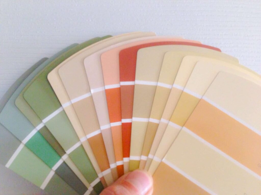
Paint chips are photographed and printed under controlled, neutral lighting. Your home has its own lighting personality — the color temperature of your bulbs, the direction your windows face, the color of your floors. Always buy a sample pot, paint at least a 24-inch square directly on your actual wall, and live with it for 48 hours before committing.
Tip 2 — North-Facing Rooms Need Warm Undertones
North-facing rooms receive cool, indirect light all day. Any blue-gray or cool white in a north-facing room will look flat and slightly depressing. The fix is to choose the warm version of whatever color you love. If you want gray, choose greige. If you want white, choose a creamy off-white. If you want blue, choose a version with green or teal undertones. This one adjustment makes a dramatic difference.
Tip 3 — Complex Colors Are More Liveable
Here is a professional secret worth remembering: if you take the color you love and choose a slightly muddier or more complex version of it — one with additional gray, brown, or muted undertones — it will be far more liveable than the pure, saturated version. Pure, bright colors look wonderful on a paint chip and exhausting on a full wall. Complex, slightly grayed versions of those same colors feel sophisticated and easy to live with year-round.
Tip 4 — Finish Matters as Much as Color
The sheen of your paint finish changes how a color looks and how the room feels.
| Finish | Best Use | Effect |
| Flat / Matte | Ceilings, low-traffic walls | Absorbs light, hides imperfections, velvety look |
| Eggshell | Bedrooms, living rooms | Slight sheen, wipeable, everyday use |
| Satin | Hallways, kids’ rooms | Balanced sheen, durable and cleanable |
| Semi-Gloss | Kitchens, bathrooms, trim | High sheen, moisture-resistant, easy to clean |
| Gloss | Doors, cabinetry, accents | Maximum sheen, dramatic, very durable |
Tip 5 — Undertones Are Everything
Every paint color has an undertone — a subtle second color lurking beneath the primary hue. A beige might pull pink, yellow, or green. A gray might pull blue, purple, or brown. When that undertone conflicts with another color in your room — your flooring, your furniture, your cabinetry — the clash can be jarring and inexplicable. Learning to identify undertones is the single most valuable color skill a homeowner can develop. When in doubt, consult a professional.
Tip 6 — The 60-30-10 Rule for Color Balance
Professional designers use a simple formula for balancing color in every room: 60% of the room is the dominant color, typically walls and large furniture; 30% is the secondary color through rugs, curtains, and secondary furniture; and 10% is the accent color through pillows, artwork, accessories, and lamps. This ratio creates visual harmony without monotony — use it every time.
Tip 7 — One Consistent Color Throughout Open Plans
In open-plan homes, using one consistent warm neutral color through connected spaces creates a far more high-end, cohesive feeling than using different colors in each zone. Reserve your boldest, most personality-driven colors for distinct rooms with doors — bedrooms, home offices, dining rooms. Keep open-plan living areas unified under a single sophisticated neutral.
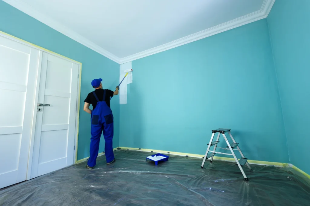
Why Professional House Painters Make All the Difference in 2026
Here is something worth saying plainly: the color is only as good as the application. You can choose the most perfectly calibrated shade on the planet and have it look mediocre if the prep work is poor, the edge work is messy, or the wrong sheen is applied to the wrong surface. This is precisely why professional house painters are not a luxury — they are an investment.
What Professional Indoor Painting Services Include
When you hire professional indoor painting services from Gregory Martin Painting, here is what you are actually paying for.
Surface Preparation
This is where amateur results diverge from professional ones. Proper prep means cleaning walls of grease and dust, filling holes and cracks, sanding rough areas smooth, priming where necessary — especially after repairs or on new drywall — and properly protecting floors, trim, and fixtures. Without proper prep, even the most expensive paint will peel, crack, or look uneven within months.
Expert Color Consultation
Our team brings professional knowledge of undertones, lighting conditions, finish selection, and color psychology to every project. We walk through your home, assess your existing fixtures and flooring, and recommend a color palette that works with your home’s specific light and architecture — not just what looked good in someone else’s space.
Precision Application
Professional painters apply paint with the consistency, cutting-in precision, and roll technique that produces smooth, streak-free results. We know how many coats each color and surface requires. We know which primers dramatically improve the performance of dark colors. We know how to achieve a perfectly flat matte ceiling or a furniture-quality gloss finish on cabinetry.
Durability and Longevity
A professionally painted interior, using premium quality paint applied correctly, should look beautiful for seven to ten years with normal care. DIY results typically require touch-ups within one to two years and often motivate a full repaint within three to four years. The math clearly favors doing it right the first time.
Questions to Ask Your Painting Contractor Before Hiring
Before trusting anyone with your home’s interior, ask these questions: Do you use premium paints from brands like Benjamin Moore or Sherwin-Williams? Is surface preparation included in your quote? Do you carry liability insurance and workers’ compensation? Can you provide references from similar projects? Do you offer a warranty on your work? Will the same crew complete the job from start to finish?
At Gregory Martin Painting, the answer to every one of these questions is yes — and we encourage every homeowner we speak to, whether they choose us or not, to insist on these standards from any contractor they hire.
How to Choose the Right 2026 Paint Color for Your Specific Home
All the trend information in the world is only useful if you can translate it into the right decision for your specific house, your specific lighting, and your specific lifestyle. Here is a practical decision framework.
Step 1 — Assess Your Light
Walk through every room you plan to paint at three different times of day: mid-morning around 9 to 10 AM, early afternoon around 2 PM, and early evening around 6 to 7 PM. Note whether each room feels warm or cool at each time. North-facing rooms need warm-undertone colors. South and west-facing rooms can handle cooler shades without them feeling cold.
Step 2 — Start With Your Fixed Elements
Your floors, countertops, kitchen cabinets, and large furniture pieces are not changing. These are your fixed elements, and your paint palette must complement them. If your floors are warm honey oak, your walls need to lean warm. If your floors are gray or espresso, you have more flexibility. Identifying your fixed elements’ undertones is the most reliable starting point for any color selection.
Step 3 — Decide Your Mood Intent
Ask yourself what you want each room to feel like — not look like, feel like. List one or two words for each room: calm, energized, romantic, focused, playful, sophisticated. Then match those emotional intentions to the color psychology guidelines: warm tones for energy and coziness, cool tones for calm and focus, deep tones for intimacy and drama.
Step 4 — Sample Generously
Never commit to a full room based on a paint chip. Buy sample pots and paint 12 to 24-inch swatches on the actual walls you are painting. Leave them up for 48 to 72 hours and live with them through different times of day and different lighting conditions. This single step prevents the vast majority of paint regrets.
Step 5 — Call the Professionals
Once you have narrowed it down to two or three finalists, this is the perfect moment to bring in Gregory Martin Painting for a professional color consultation. We will walk through your home with fresh eyes, validate your choices, flag any undertone conflicts, and recommend the right finishes for each surface. This consultation alone often saves homeowners from costly repaints.
Color Trends by the Numbers — 2026 Interior Paint Data
The data behind 2026’s trending interior paint colors confirms what designers are observing in the field. Green paint searches increased by over 60% from 2022 to 2025, with botanical greens now representing the single fastest-growing interior color category. Cool gray paint searches have declined for three consecutive years, with warm neutrals overtaking them as the most searched neutral category. Dark accent wall searches peaked in 2024 and have held strong through 2026, confirming the enduring appeal of moody focal points.
The color drench technique grew as a search term by 220% between 2023 and 2025, reflecting the mainstreaming of the full-saturation paint approach. Homeowners who use professional indoor painting services report significantly higher satisfaction with their final color results compared to DIY painters, according to paint industry consumer surveys. The average homeowner repaints interior spaces every 7.3 years — making every paint decision a long-term commitment worth getting right.
Frequently Asked Questions About Modern Home Paint Colors in 2026
What is the most popular interior paint color in 2026?
There is not a single most popular color, but the dominant category is warm neutrals and botanical greens. If you want the single most universally flattering and versatile choice for 2026, a warm greige — something between beige and gray with yellow-brown undertones — remains the most widely used foundation color in modern homes. Pair it with a botanical green or deep charcoal accent and you have the defining aesthetic of 2026.
Is gray still in style for 2026?
Pure cool gray is definitively out for 2026. The millennial gray era is over. However, warm grays — those with beige, brown, or green undertones — remain very much relevant. The distinction matters enormously. When clients say they want gray walls in 2026, our team at Gregory Martin Painting steers them toward warm-gray hybrids like Edgecomb Gray or Revere Pewter rather than cool, blue-gray shades that will look dated immediately.
What colors make a modern home look bigger?
Lighter, warmer colors reliably make rooms feel more spacious: warm whites, creamy off-whites, soft warm greiges, and light sage greens. The key technique is keeping the floor darker than the walls and the ceiling lighter than the walls. This vertical gradient creates the illusion of greater height and openness.
Can I use dark colors in a small room?
Yes — and designers do it all the time. The key is commitment. Painting walls, ceiling, and trim all the same deep shade in a small room creates an intimate jewel-box effect that reads as luxurious rather than claustrophobic. Small bathrooms and powder rooms are perfect candidates for bold, dark colors precisely because the limited square footage controls the heaviness of the effect.
How long does professional interior painting take?
For a standard room of approximately 12 by 12 feet, professional indoor painting services typically take one to two days including prep work, priming where needed, two coats of color, and cleanup. A full-home interior repaint for an average-sized house typically takes between four and seven days for a professional crew. DIY timelines are generally two to three times longer for comparable results.
The Gregory Martin Painting Approach
At Gregory Martin Painting, we have spent years refining a process that goes beyond simply rolling paint onto walls. We start with color — not just what looks good in theory, but what will work in the specific conditions of your home. We assess your light, study your fixed elements, and discuss how you use each room and how you want it to feel. Then we match you with the right product, the right finish, and the right approach for every surface.
We believe that paint is the single highest-value-per-dollar improvement you can make to a home. No renovation, no furniture purchase, no accessory update delivers the transformative impact that a professionally executed repaint does. And with 2026’s extraordinary lineup of modern home paint colors — from the deep sophistication of Silhouette to the botanical warmth of Warm Eucalyptus, from the bold drama of Hidden Gem to the timeless serenity of warm greige — there has never been a better time to reimagine your interior spaces.
Whether you are working with a single room or planning a comprehensive whole-home repaint, Gregory Martin Painting brings expertise, care, and a genuine passion for beautiful color to every project we take on. We are not just professional house painters — we are your color partners.
Final Thoughts — Your 2026 Interior Starts With One Decision
The truth is simple: most homeowners overthink paint colors and underestimate the power of professional application. The best approach is to choose a direction — warm or cool, bold or quiet — and then commit to it with excellent prep, premium materials, and the skill of experienced hands.
The modern home paint colors of 2026 are some of the most sophisticated, emotionally intelligent, and liveable color choices the industry has produced in a decade. From Benjamin Moore’s complex Silhouette to Behr’s luminous Hidden Gem, from the sandy warmth of Universal Khaki to the restorative quiet of Warm Eucalyptus — this year’s palette is an invitation to create a home that genuinely feels like yours.
Do not let another year go by living in colors that do not serve you. Let Gregory Martin Painting help you find the perfect palette, execute it flawlessly, and experience firsthand what a thoughtfully painted home can do for your everyday life.
Ready to transform your space? Contact Gregory Martin Painting today for a free color consultation and interior painting estimate.